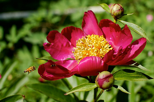
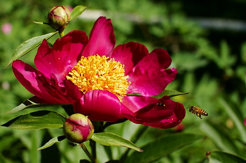
I took a pretty good picture this afternoon in the yard. I got a shot of a bee coming in for a landing on a peony. As I looked at it with my editor eyes I thought how nice it would be if this or that were a little different. Being a neophyte with Photoshop, I thought, "Ah, a teaching moment." Here is the end result:
View LARGE On Black - it's worth the look.
I'll post the original at the end, but in summary, here is what I did to the photo. Most obviously, I flipped it so that the bee was coming in from the left. We read L->R so our eyes tend to work that way by default. This way your eye finds the bee as it goes to the peony. Next I selectively reduced the brightness of the yellow part of the flower, taming the overexposed highlights. I did the same for the top right leaf, and the two unopened buds. I wanted to soften how much they drew the eye. Finally I selected the bee and added a touch of brightness and sharpness so that he popped a bit more.
In the Darkroom Ages, I could have done those same things by dodging or burning as the negative developed. I think this is well within the bounds of using Photoshop, yet still calling the result a photograph. Once one crosses the line and begins moving parts of the image (relocating the bee for example) or adding elements from other photographs, the line gets fuzzier and I wonder if it is still a photograph or is it collage or (to borrow a phrase from local shooter Chris Norris) photo-illustration? This is something I think about a lot these days. I don't know if there is a definitive answer, and it certainly is a continuum rather than some either-or situation. If you have thoughts on the topic, I'd love to hear them.
Here is the original image, straight from camera:
Friday, June 5, 2009
Peony and Bee
Subscribe to:
Post Comments (Atom)


suggestion(s): post a photo similar in composition & tweaking and ask us to see if we can tell which one is the original and which one is photoshop. There are elements in both peony photos I like. I'd like to see the original unaltered and flipped so the bee is on the left. thanks! :)
ReplyDelete"Anonymous" had difficulty posting a comment, so I reproduced the direct email here...
ReplyDelete++++++
I prefer the original, and here's why:
1.) While "reading" left to right, it's cool to see the big beautiful flower (which dominates the photo anyway) and then keep going to "discover" the cute little bee. Aha! This presentation invites your eye to come look closer.
2.) The depth of yellow in the center of the peony is just the right tone to best set off the red of the petals. Diminish the yellow, and somehow the red goes too, at least for my eyes *grin*.
3.) Increasing the sharpness of focus on the bee very subtly changes it's highlights...which is a little bit unsettling. But really, I just don't think sharpening is needed, the bee is in very good focus with a nice background as it is.
Good shot!