I have been doing some more experimenting in the studio. I have no problem with creating images of women that men, and most women, find attractive and flattering. Being a man whose preferred gender is women, I have less of a clue about crafting images of men that women, and most men, would find attractive. To that end, I shot a series of photos to test the waters.
I printed half a dozen of them and showed them to a few friends who I knew would have opinions and be comfortable voicing them. From the women the answers were all over the board; absolutely no consensus. The men were slightly easier to please. I suspect this has to do with men - in general - being more visually oriented.
Below I have three pairs of photos. The first is full, as shot, while the second is a crop based on some feedback and my own judgement.
The tradition of boudoir photography of women either for their partner or themselves is rich. There is significantly less of men, for either themselves or their partners.
I ask you, dear readers, to comment. You can do so anonymously if you choose by clicking on the "Comment" link and choosing the "Anonymous" option. If you are a person who prefers men, consider that the image is of your sweetie and is a gift to you. If you are a man, regardless of gender preference, also consider the image is of yourself. In those contexts, I would like to know if you prefer the full image, or the crop, and why. If you only want to comment on a single pair, that is fine with me.
Please note these may be Not Safe For Work. Follow the link to the "Read the rest of the post" to see the images.
PAIR 1.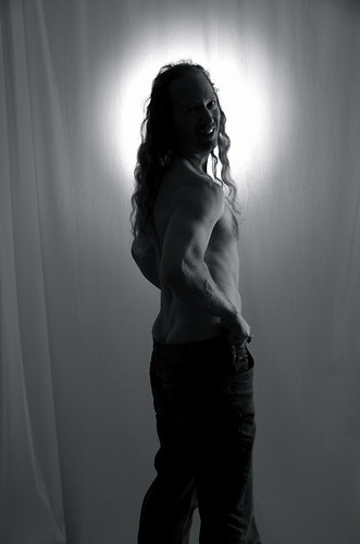
Full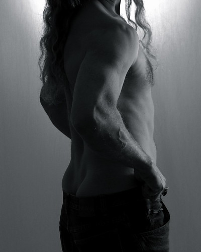
Crop
PAIR 2.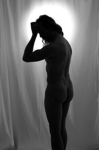
Full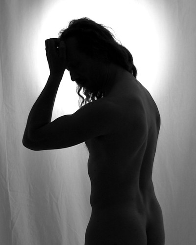
Crop
PAIR 3.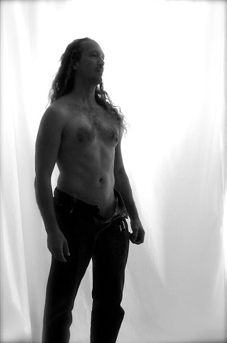
Full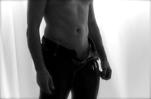
Crop
Thank you for any feedback you care to leave as a comment!
Tuesday, October 13, 2009
Of Men (Not Safe For Work)
Subscribe to:
Post Comments (Atom)


Set 1: full - since you're looking at the camera, I like the personal connection
ReplyDeleteSet 2: crop - in silhouette, I like the focus on the area rather than the whole
Set 3: crop - having your face without looking at the camera is somewhat distracting
Nice bod, by the way!
Okay... I'm gonna be really honest. Nothing to be taken personally from the nice bod. Looking at it from the guidelines you set. Ready?
ReplyDeleteset #1: Like Beth said, I like the connection and the smile. Can't say that the pose does a lot for me. And, in fact, I feel the pants bunching is a detraction from the nice bod. (No offense - the crop especially is reminscent of plumber's crack. Sorry.) So, except I know there's a nice body and I get to see your handsome mug, not one I would pick. Moving on...
Set #2: I like the silhouette - crop is better. I like implied nudity where you can kinda see, but it leaves something to the imagination as well. More on likes later. You look puzzled.
Set #3: Definitely my favourite. Crop more than full. Again the implications. If the face is in the shot, it is helpful if he's looking at the camera like he's teasing the girl or like he would totally jump her bod if he could only figure out how to get out of the painting. You know what I mean? He's definitely in control - even if he looks casual.
Hope that helps.
Hi Nataraj -
ReplyDelete1. I agree with the previous comments. Not one that does much for me.
2. The crop is better than the full, but you look like you're scratching your head... which is a bit distracting.
3. Love this one. The crop more than the full, because of the reasons already stated.
Erica
Ok.
ReplyDeleteSet one. I liked neither. I felt the pics seemed rather funny, like they were a joke. I guess, to this guy, I felt like you were getting ready to moon someone.
Set two. I liked the crop much better, although, in each, i found the light around the head bothersome and distracting.
Set three. I liked the crop better as well. Of course, with no face, it would not make much of a gift. A picture of my wife with no face isn't really a picture of my wife, it is a study in figure and form.
From the chest down, you seem relaxed. In the uncropped one, you seem not so. Your face seems to betray a readiness for movement or action that does not sit well with the rest of the picture.
I am going to look at these like "art nudes" as in form and light, not erotica.
ReplyDeleteSet 1: I also noticed the plumber look in the crop, but the full shot seemed to casual. wasn't sure what this was trying for. Playful yes. Might have worked better with tight jeans.
set2: I actually like the full shot. reminds me of classic greek statues, but the light spot it too bright compared to the rest. The light gradient works better in the crop. Maybe try a crop going down to the knees and photoshop the light balance like you did in the crop.
set 3; I like them both. They do different things. The crop is very Mapplethorpe inspired.
I think there are lots of examples of nude men in art (statues and paintings). Maybe work from those classics, mix in a little Mapplethorpe and twist.
- jessica
I love that you try to explain the lack of consensus from the women with "men are more visualy oriented." Nope; I'm pretty sure it's just that we women can't agree on anything :)
ReplyDelete1. I feel like as a photographer, you don't know where you're focusing here. There is a big halo of light around your head which is just distracting. The pants half on half off doesn't do a whole lot for me either. I think you have a strong upper body shot here that could be excellent if your back/shoulders where better lit. I don't dig the headless crop. A crop about there with head showing (and pants fully on--see above) would be perfect.
2. I like this a lot, prefer the crop--as someone said, implied nudity is almost more interesting/attractive than full. I don't like the way the head is so dark in contrast to the body (and hidden in hair). I think either doing the whole body in more of a silouette or lighting the head more would work, but this makes it seem like your head is blacked out or something. Also, the "head-scratch" aspect of the pose doesn't quite work--I think hand by face may be something that looks better on women.
3. The crop is sexier, but much less personal. I'd like to see the face kept and most of the white curtain cropped so that you own more of the picture.
This is Dawn-I don't have an id!
ReplyDeleteFor the first set....Something about the shadow of the face draws away from the body-it would be better I think were you looking upwards or away a bit-more natural and sensual. Maybe even tone down the halo light a bit. I think that would give more of a feeling you are slowly undressing. Because of that I like the crop better, but if it is boudoir photos, think of how you see women-how often do you give a "body only" shot?
Second set: I really like them both. I like the ability to see the contours of the body-this pose would probably work better for some than for others.
Third set-I do think looking at the camera would be better. Maybe do something with the arms as well. It looks free but rigid at the same time in my opinion. As far as the crop shot goes, it reminds me of a jeans commercial-I think it would depend on the viewer's preference if you see that as a good thing or not! It is sexy but....
I'm going to jump in here and say thank you for the comments so far. I do really appreciate them.
ReplyDeleteIt is quite interesting to me that the reactions of women who have commented (including face-to-face looking at prints) vary so significantly. More than one said no way do they want the man looking at the camera - to domineering or bar-room predatory! Others have said absolutely looking at the camera, ready to pounce. Most viewers don't like the light. That's cool, as it was simply an effect I wanted to test out. It was a deliberate nimbus designed to obscure my face.
The crops work to me only as a form study. If this were a portrait of a nude or semi-nude man for his partner, a crop is not going to fly.
I'm learning, so please keep the comments coming! Tell it like you see it. For me, this is a brain-storming session and I appreciate all the feedback.
~Nataraj
Sets one and three, cropped; set two, uncropped (and of the three sets, that's easily my favorite). I think I'd have the same preference regardless of the model, but it's possible that would vary depending on the body type and the model's relationship to the camera.
ReplyDeleteAnd I'd change the lighting somewhat: the strong light behind the head looks unfortunately like a halo. If the light were a bit more diffuse I think it would work better.
In general, I like the cropped shots better. The second one reminded me too much of Jesus to find the sexy in it, though. :) Too much nimbus.
ReplyDeleteIn all cases I liked the cropped ones better. I'm not creative or expressive so I can't even explain why. But I do like them - a lot!!!
ReplyDeleteI agree about the light. I like the cropped ones better, partially because the cropping gets rid of most of the Jesus/halo effect of the light, and partially because the cropped pieces make the subject seem closer-up, within touching distance---and therefore more intimate feeling---while the full-figure shots seem farther away and out of reach.
ReplyDeleteCommenting as a straight woman, I like pair 3. Viewing the photo simply as "art" the crop is very beautiful and nicely framed. However, if this was a gift from my sweetie, I would want to see a frame including his face with an intimate look into the camera. Some torso included would be bonus... Having a feeling of being close is good, as others mentioned. I love the more diffused light.
ReplyDeleteThe poses seem like the sort of poses that women usually do. So if you're looking to arouse non bi girls, you might want to have your men display a more "call to action" feel. They should have a lot of energy in the pose just waiting to be released. I don't care if they are looking at me or not. I just want to know that they can handle the job. ;)
ReplyDeleteThe first one reminds me of a flirtatious girl pose only you forgot to bend over just slightly. :) Without the bending it doesn't really work. If you're gonna be cheeky, be cheeky (pun intended). lol
The second again if very feminine, soft and introspective.
The third is rather neutral. The subject seems to be holding back or waiting. The shoulders rolled forward lack confidence. Confidence is sexy. The crop is sexy because the body is beautiful and it allows my imagination to kick in.
Hope that helps. I love you as the model. Modeling isn't as easy as it seems. I know, I suck at it. :) Thanks for sharing the process.
Love, Dawn Lapierre
In the first and second set, have you considered moving the backlight a bit lower, so that it "halos" more of the body? That might make the picture less-religious and more interesting in silhouette. Maybe around the throat chakra or the solar plexus? Is there a way to make it more oval/less circular (to line up behind more of the body)?
ReplyDeleteFor the second set, I'm a sucker for back pictures. I think light and shadow can be particularly useful there. Maybe the hand to the head is distracting, but to get a good back/shoulder picture, the arms need to be active/up somehow. There's probably a better pose.
The third set strikes me as more fantasy novel-ish. Which can be fine, but doesn't float my boat much.
As for looking at the camera, I could see using a mixture. I mean, there are some moods that you want to set up with a direct gaze, and some moods that are more coy. :)