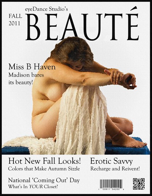
I took a recent image and envisioned what it might look like as a magazine cover. Let me assure you that graphic design is not my forté, and will not be any time soon. I wanted the cover to be a bit staid; not a high-fashion glamor magazine like Harper's Bazaar Cosmopolitan nor as cluttered as Rolling Stone. I was aiming for a look a bit more stark, like Harper's.

Click HERE to view large on a white background.
This is just for fun, and I would enjoy your comments. On a geek note, the QR code, should anyone photograph it with a camera that reads such things, will direct them to my web page.
Wednesday, October 12, 2011
Faux Cover Shot
Subscribe to:
Post Comments (Atom)


No comments:
Post a Comment
If you don't have a blooger or "open" ID, you are free to use "Anonymous" for your posts, and leave your name if you are willing.